Prototype Devlog 2 Week 6
Week 6:
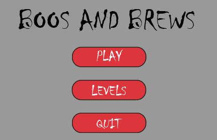
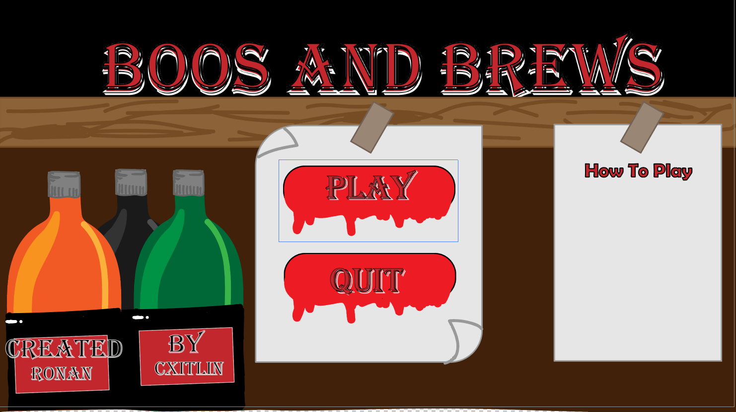
This week I spent all my time on the home screen. We had this bland, grey placeholder, but I wanted to change it, so I started sketching out different ideas until I came up with this one below. I liked how it shows orders, bottles and blood, so it gives the game away, but doesn't at the same time. I believe they all tie nicely together.
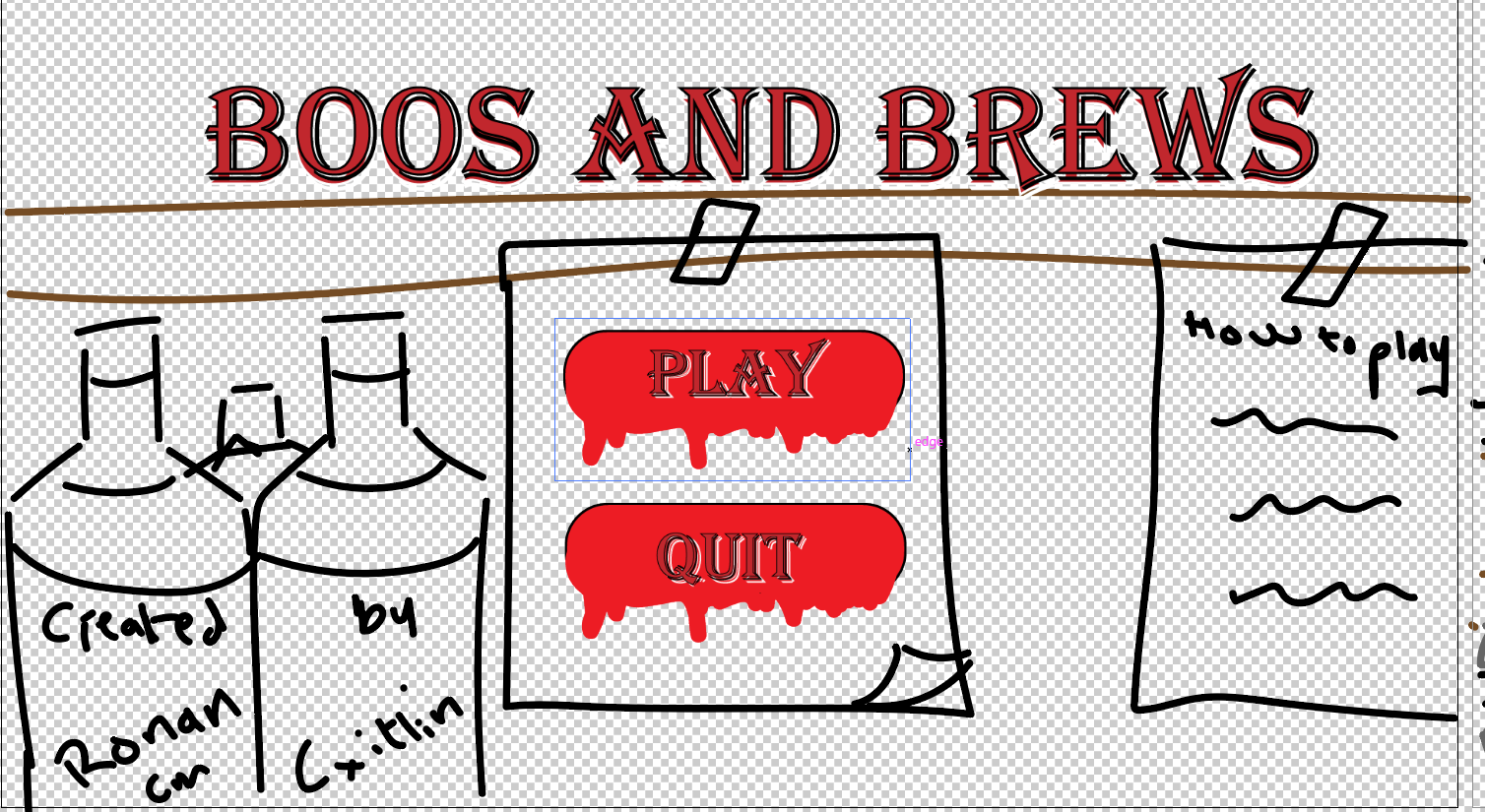
The new step was to try to find colours that worked well together but didn't overpower the important parts that needed to stand out. I decided to go for dull colours for the bottles in the corner, browns for the lower background to indicate the bar counter and black for the rest of the background to indicate darkness and bloody buttons to indicate that not everything is normal.
Leave a comment
Log in with itch.io to leave a comment.